Limitless Luxury
New Zealand Media & Entertainment X Tourism Australia

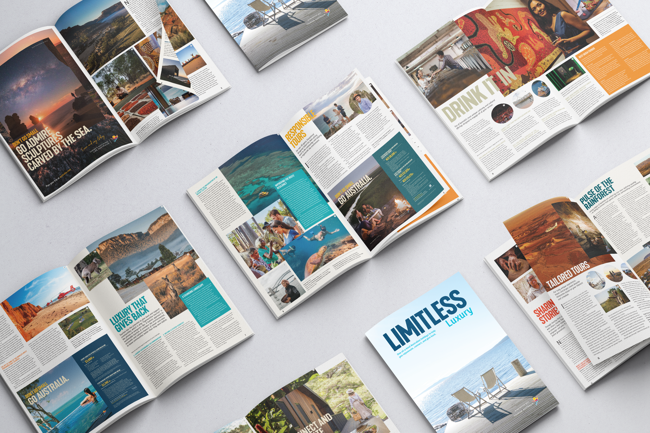
This 16-page editorial magazine was developed in collaboration with Tourism Australia as part of a broader advertising campaign with NZME. Designed to inspire travel by showcasing Australia’s stunning landscapes and experiences, this was the most extensive content project I had undertaken whilst at NZME. I was responsible for designing all layouts (excluding advertorial pages and the cover supplied by Tourism Australia), curating and editing imagery, and preparing files for print production.
This project was an exciting challenge, allowing me to push the boundaries of the client’s brand guidelines, experiment with visual storytelling through striking landscape and portrait imagery, refine document flow, and navigate the complexities of large-scale editorial design.
Year
07/2022
Credits
Katrina Chapman,
Senior Commercial
Project Manager.
Donna Keane,
Commercial Projects GM.
Travel Magazine Internal Editors
Project Name
Limitless Luxury
NZME x Tourism
Australia
Role
Art Direction
Layouts
Editoral Designer
Proof Reader
Pre-press editor
Photo editor


Process
As a high-budget, large-scale project for NZME, this magazine involved multiple internal and external stakeholders. Navigating the complexities of a collaborative workflow —working closely with copywriters, editors, project managers, and pre-press production teams—was an invaluable learning experience. It provided deep insight into the editorial feedback and development process while also refining my understanding of the intricate details of press production.
Development
With an established brand look and feel as my foundation,
I approached this project by using color strategically to enhance the content.
The richness of the imagery called for a careful balance, which I achieved through complementary text boxes and matching headings. While certain layout elements—such as solid text boxes—were predetermined by the brand’s visual identity, I found the challenge of problem-solving within these constraints both engaging and rewarding. It allowed me to refine the composition, ensuring all content and imagery worked harmoniously within the design.


My passion for design has always been deeply intertwined with a love for typography. The way subtle details shape how a reader engages with content has always fascinated me.
This project allowed me to delve into the ‘why’ behind each page—exploring how elements like line length and kerning enhance readability, particularly at a larger scale.
I’m grateful for the creative freedom I had within the brand’s guidelines and for the opportunity to collaborate with an incredible team who entrusted me to bring this beautiful campaign to life.