ZM Next Flight
ZM Radio Network & NZME

In collaboration with the wider Radio Marketing and ZM team, I played a key role in bringing the 2023 ZM Next Flight competition to life. As one of the station’s largest and most anticipated promotions, the competition had a strong foundation from previous years. My task was to refine and elevate the existing visuals, aligning them with ZM’s current branding standards while maintaining the excitement and energy the competition is known for.
The competition’s mechanics are simple yet thrilling: ZM listeners register for the chance to win a mystery holiday each day—but there’s a catch! They won’t know their destination (international or domestic) until the morning they arrive at NZME, bags packed and ready to go.
Understanding this element of surprise was crucial in crafting visuals that were not only engaging and dynamic but also enhanced the overall audience experience—building anticipation and excitement at every touchpoint.
Credits
Ross Flahive, ZM Content Director
Jennifer Pryor, Senior Marketing Manager – Audio
Jacquline Davis, Marketing Manager – Audio
Sidak Mahli, Marketing Coordinator – Audio
Xanthe Williams – Creative Director
Helen Scott – Mac Operator
Project Name
ZM Next Flight
Role
Art Direction
Graphic Design
Year
10/03/2023

ZM Next Flight Announcement Social Post. In collaboration with Air New Zealand

Development

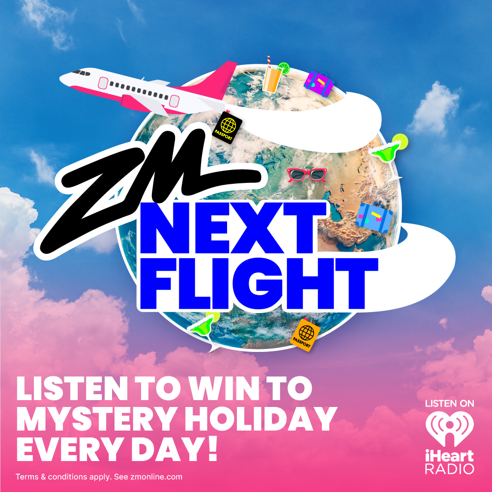
Building on the previous year’s artwork (top image) was instrumental in shaping the competition’s visuals. Not only was the prior design successful, but it also provided a solid foundation for updating the branding. I began by transitioning away from the 3D style to align more closely with the newer branding, incorporating a realistic globe image and overlaying playful, vector-based icons and imagery.
After gathering feedback from stakeholders, we refined the approach, moving back towards realistic imagery, but with a 'sticker' effect that blended the older and newer styles. We also incorporated photoshopped images of potential winning locations. At this stage, we focused on experimenting with color combinations and the placement of the planes to highlight key elements. Ultimately, we decided the original sky background lacked the vibrancy and playful energy needed for out-of-home advertising, such as billboards, and didn’t fully capture the excitement the competition was meant to convey.
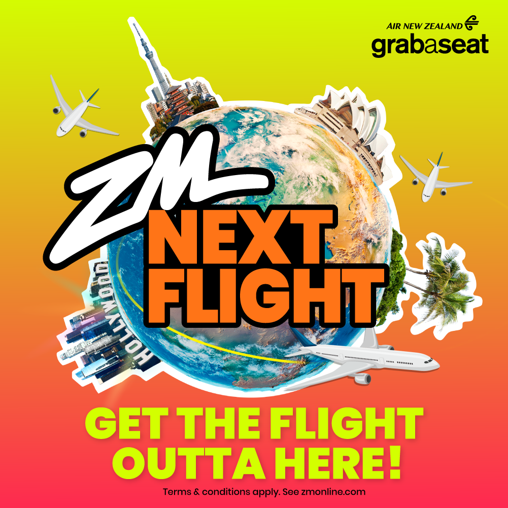
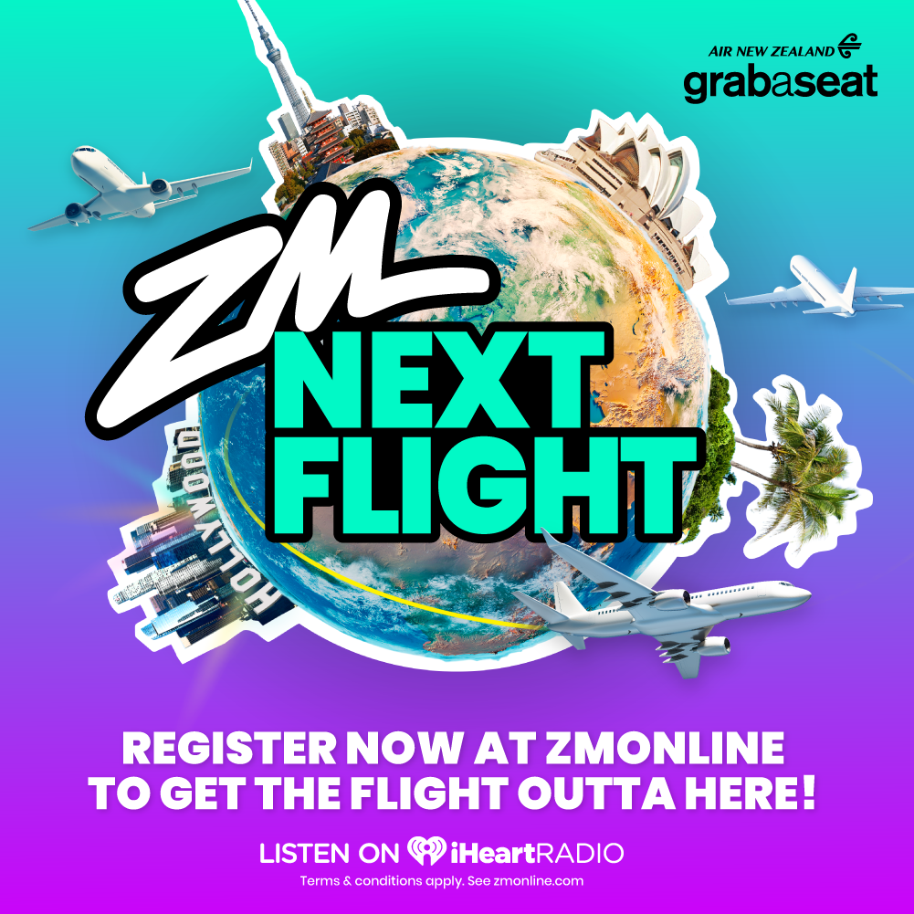
The two color options above were the final developed choices, but I felt the orange variation wasn’t on-brand enough and lacked the necessary visual impact. Ultimately, we moved forward with the teal/blue/purple option, incorporating smaller yellow details—such as the plane trail—for added contrast. Keeping the copy and logos in black and white ensured maximum clarity and legibility across all asset sizes.


Animation
While these animations weren’t overly elaborate, they added a sense of depth to the digital HTML ads and social story assets. We focused on keeping them simple enough to catch the attention of users scrolling quickly while ensuring they remained engaging once viewers stopped to watch.


